Have you ever visited a website and immediately felt lost? You couldn’t find what you were looking for, and frustration started to set in. Poor website navigation can make or break the user experience, but what exactly makes website navigation effective and user-friendly?
In this article, we’ll dive into the world of website navigation design and explore how to create a seamless and intuitive navigation system for your website. From responsive and accessible designs to intuitive structures and best practices, we’ll cover it all to ensure your visitors can easily find what they’re looking for.
Key Takeaways:
- Good website navigation is crucial for creating a positive user experience.
- User-friendly website navigation improves website usability and enhances the overall user experience.
- Creating an intuitive website navigation structure involves establishing a logical hierarchy and utilizing internal linking.
- Website navigation design should follow best practices such as using clear and visible navigation elements.
- In addition to navigation design, other factors that can improve user experience include mobile-friendly design, internal search, and page speed optimization.
The Importance of User-Friendly Website Navigation
User-friendly website navigation is essential for enhancing the overall user experience and improving website usability. It plays a crucial role in helping visitors quickly and easily find the information they’re looking for. When users can navigate a website seamlessly, it reduces frustration and increases engagement, leading to higher customer satisfaction and better conversions.
Effective website navigation should be intuitive and accessible, allowing users to effortlessly comprehend the relationships between individual pages on a website. By implementing best practices in website navigation design, you can ensure that your website is easy to navigate for your target audience.
Clear and Concise Navigation Labels
- Ensure your navigation labels are clear, concise, and descriptive, guiding users to the relevant sections of your website.
- Use terms that are familiar and easily understood by your target audience.
- Avoid jargon or ambiguous labels that may confuse users.
Standard Navigation Elements
Incorporate standard navigation elements that users are already familiar with. This includes using a horizontal navigation bar in the header, dropdown menus for subcategories, and footer menus for additional links. Consistency in navigation elements helps users understand how to navigate your website, reducing cognitive load and enhancing the user experience.
Proper Page Ordering
Arrange your pages in a logical and hierarchical order. Place important pages or sections higher in the navigation hierarchy, making it easier for users to access them quickly. If certain pages are buried deep within the site structure, users may lose interest or struggle to find the desired content.
Website Navigation Examples
Looking at successful website navigation examples can provide valuable insights and inspiration for designing your own user-friendly navigation system. Let’s take a look at one such example:
| Website | Description |
|---|---|
| A sleek and modern e-commerce website with a user-friendly navigation menu that allows visitors to browse different product categories with ease. The navigation labels are clear and concise, and the dropdown menus provide quick access to subcategories. The minimalist design and intuitive navigation contribute to a seamless shopping experience. |
Incorporating user-friendly website navigation practices based on successful examples like the one above can significantly enhance your website’s usability and improve the overall user experience. By ensuring clear navigation labels, using standard elements, and ordering pages correctly, you can create an intuitive navigation system that helps users find what they’re looking for effortlessly.
Creating an Intuitive Website Navigation Structure
When it comes to designing a website, one of the key factors for a positive user experience is an intuitive navigation structure. Ensuring that users can easily navigate through your website and find the information they need is essential. To achieve this, there are a few strategies you can employ.
The Semantic Core Approach:
One approach is to create a website structure based on the semantic core. This involves identifying keywords that are closely related to the content you offer and using them to define the main categories and subcategories of your website. By organizing your content around these keywords, you can create a navigation structure that is aligned with user expectations and makes it easier for them to find what they are looking for.
| Benefits of the Semantic Core Approach |
|---|
| Aligns website structure with user intent |
| Improves discoverability of relevant content |
| Enhances SEO by targeting relevant keywords |
| Facilitates intuitive navigation |
Competitor Analysis:
Another approach is to analyze your competitors’ websites. By studying common patterns in their navigation systems, you can gain insights into what works well and what doesn’t. This research can help you identify best practices and adapt them to your own website. However, it’s important to remember that while competitor analysis is useful, your navigation structure should ultimately cater to the specific needs and preferences of your target audience.
Regardless of the method you choose, it’s crucial to ensure that all important pages are easily accessible and have a logical hierarchy. This can be achieved by incorporating breadcrumbs to help users understand their location within the website and utilizing internal linking within content to guide users to related pages. These practices enhance the overall user experience and make it easier for users to navigate through your website.

Furthermore, conducting a website accessibility audit is highly recommended. This audit ensures that all important pages are included in the navigation system and easily accessible to users, including those with disabilities. Making your website accessible to everyone enhances usability and inclusivity, contributing to a more positive user experience overall.
Best Practices for Designing Website Navigation
When it comes to creating an optimal user experience, following best practices for website navigation design is essential. By implementing these practices, you can ensure that your website is intuitive, user-friendly, and easy to navigate, resulting in higher engagement and conversions.
Clear Navigation
To make your navigation elements clear and easily visible to users, consider using the following:
- A horizontal navigation bar in the header, prominently displayed
- Dropdown menus for organizing subcategories
- Footer menus for additional links
By using these standard navigation elements, users will quickly understand how to navigate your website and find the information they need.
Responsive Design
In today’s mobile-first world, responsive design is crucial for providing a seamless navigation experience across different devices. With more than half of internet traffic coming from mobile devices, your website must adapt and display properly on various screen sizes. Responsive design ensures that your navigation remains accessible and user-friendly, regardless of the device being used.
Consistent Navigation
Consistency in website navigation is key to creating a familiar and intuitive user experience. By using familiar navigation patterns throughout your website, users will quickly learn how to navigate and find their way around. Consistent navigation elements, such as positioning, styling, and labeling, help users feel confident and comfortable while exploring your website.
Website Speed Optimization
Optimizing your website’s speed is crucial for keeping users engaged and preventing high bounce rates. Slow-loading pages can lead to frustration and a negative user experience. By optimizing page speed through techniques like image compression, minifying code, and leveraging caching, you can ensure that your website loads quickly and smoothly, enhancing the overall user experience.

Implementing these best practices for website navigation design, including clear navigation, responsive design, consistent navigation, and website speed optimization, will result in a user-friendly and easy-to-navigate website that keeps visitors engaged and satisfied.
Other Ways to Improve User Experience
In addition to website navigation design, there are other factors that can contribute to a positive user experience. By considering these factors, you can ensure that your website not only has an intuitive navigation system but also delivers a seamless and enjoyable browsing experience. Let’s explore three important components that can enhance user experience:
1. Create a Mobile-Friendly Website
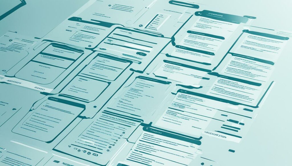
With the growing popularity of smartphones and tablets, it’s essential to optimize your website for mobile devices. A mobile-friendly website ensures that users can easily access and navigate your site on smaller screens. By implementing responsive design, your website will dynamically adjust its layout and content to fit various screen sizes. This not only improves the user experience but also boosts your search engine rankings, as search engines now prioritize mobile-friendly websites. Take a look at the image below to see an example of a mobile-friendly website:

2. Incorporate an Internal Search Feature
Internal search functionality allows users to quickly find specific information within your website. This is especially useful for websites with a large amount of content, as it enables users to bypass navigation menus and directly search for their desired content. By integrating an internal search feature, you empower your users to easily discover the information they need, enhancing their overall experience. Here’s an example of how an internal search feature can be implemented:
“Having an internal search feature on our website has been a game changer for our users. It saves them time and energy by providing instant results, especially for those who prefer not to navigate through numerous menus.”
– Amanda Thompson, UX Designer
3. Optimize Page Speed
Page speed optimization is crucial for delivering a seamless browsing experience. Users expect websites to load quickly, and slow-loading pages can lead to frustration and high bounce rates. To optimize your page speed, you can compress images, minify CSS and JavaScript files, enable browser caching, and leverage content delivery networks (CDNs). By implementing these strategies, you can significantly improve loading times and provide a smoother user experience. Remember, every second counts!
| Benefits of a Mobile-Friendly Website, Internal Search, and Page Speed Optimization |
|---|
| Improved user experience on mobile devices |
| Enhanced accessibility and user satisfaction |
| Increased user engagement and reduced bounce rates |
| Higher search engine rankings and visibility |
| Time-saving for users |
By focusing on these additional aspects of user experience, you can create a website that not only guides visitors with intuitive navigation but also engages and delights them every step of the way.
Conclusion
Website navigation design is essential for creating an optimal user experience. By implementing user-friendly navigation practices, such as clear and intuitive navigation elements, effective website hierarchy, and optimized website speed, you can enhance usability and improve search engine rankings. Taking into account user preferences and best practices in website navigation design will help you create a seamless and intuitive navigation system that meets the needs and expectations of your visitors.
When designing website navigation, it’s important to prioritize user-friendly design. This includes utilizing standard navigation elements, such as horizontal navigation bars and dropdown menus, to ensure familiarity and ease of use. Additionally, structuring your website hierarchy effectively with the use of breadcrumbs and internal linking helps users navigate through your website effortlessly.
Optimizing website speed is also crucial for providing an optimal user experience. Slow-loading pages can lead to user frustration and high bounce rates. By optimizing page speed, you can keep users engaged and improve overall satisfaction. Remember to prioritize mobile-friendly design, as a significant amount of internet traffic comes from mobile devices. Responsive design ensures that your website and navigation are accessible and user-friendly across different screen sizes.
In conclusion, by focusing on user-friendly website navigation design, you can create an optimal user experience that leads to improved usability, higher search engine rankings, and increased conversions. Consider user preferences and implement best practices to create a navigation system that guides visitors effortlessly through your website, resulting in a positive and enjoyable user journey.
FAQ
Q: Why is website navigation design important for optimal user experience?
A: Website navigation design is important because it helps visitors quickly find the information they’re looking for, improves website usability, and enhances the overall user experience.
Q: What are some best practices for creating user-friendly website navigation?
A: Some best practices for creating user-friendly website navigation include using clear and concise navigation labels, organizing pages correctly, and implementing standard navigation elements such as horizontal navigation bars, dropdown menus, and footer menus.
Q: How can I create an intuitive website navigation structure?
A: To create an intuitive website navigation structure, you can use the semantic core approach by identifying keywords related to your content and using them to define main categories and subcategories. Analyzing your competitors’ websites for common navigation patterns can also provide insight.
Q: What are some best practices for designing website navigation?
A: Some best practices for designing website navigation include using clear and visible navigation elements, implementing responsive design for seamless navigation across different devices, maintaining consistency in navigation patterns, and optimizing page speed for a better user experience.
Q: Are there other ways to improve user experience besides website navigation design?
A: Yes, other ways to improve user experience include creating a mobile-friendly website using responsive design, adding an internal search feature for easy content discovery, and optimizing page speed to reduce loading times.


